WASABI STEAKHOUSE
MENU REDESIGN
TYPOGRAPHY | 2022
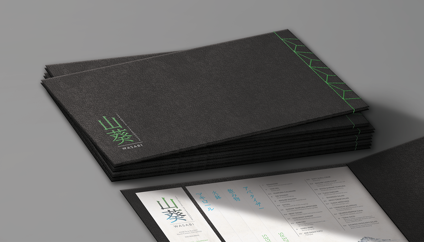
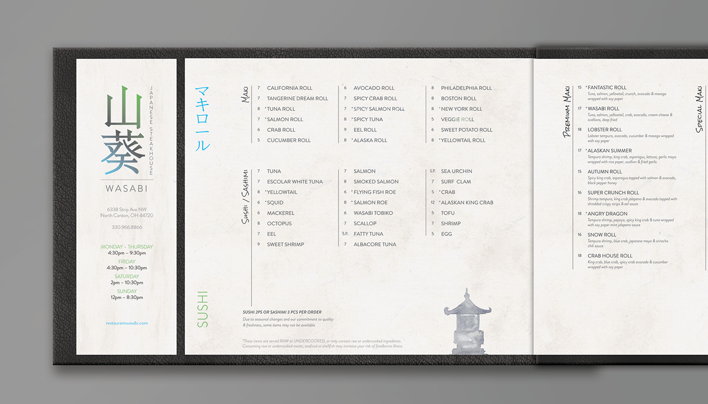
Wasabi Japanese Steakhouse is a premier dining location known for their clean, modern interior and generous hibachi chef performances (and admittedly, one of my favorite restaurants). Tasked to redesign their menu that utilizes a unique method of binding, I wanted to transform their menu into one that was more authentic to their Japanese cuisine and reflective of the both casual and luxurious dining experience. The resulting menu is entirely different in structure from the original menu—the original being a basic booklet-style menu oriented vertically.
The new menu design is instead oriented horizontally, a right-to-left booklet bound at the end with green thread in an intricate pattern true to the Japanese style of stab binding. The menu pages themselves—a textured, off-white rice paper—are accompanied by clean, sans-serif type given plenty of room to breathe, and supporting watercolor-style graphics. With the added liberty to re-imagine the restaurant logo as well, I changed the Wasabi logo to use the Japanese alphabet, again making it more authentic.